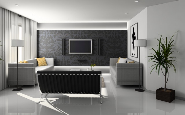
A room’s ‘feature wall’ is often known as one wall (or perhaps two walls) that you use to decorate more uniquely than the others in a space. This can often grant a home decorator room to design a space with a keen aesthetic without overdoing its presence, that is making a space feel oppressive or overdone based on the decoration placed there.
For instance, it might be that you adore a burnt orange color within a space, but painting every single wall that color can lead to your relatively small room feeling much more boxed-in than it otherwise might, the relative darkness of such a color also absorbing natural light to make the space feel dimmer and darker.
This is where a feature wall can be utilized. Instead of painting every wall that color, you opt for painting one wall, and match the design of that color around the space more subtly to give that backdrop more strength within the space itself. In this post, then, we’ll discuss a few ways you can think of the implementation regarding a feature wall, what indulgences you may wish to apply, and why you should even consider this effort to begin with.
The Main Wall
It’s good to think of a feature wall as the main wall in your living space, and what that means when you orient the space around it. This can differ, of course, depending on what exactly is in the room. For instance, a feature wall can be a great place to paint for the headboard of your bed to rest on, this way you can use the design to serve as the main focal point of the space, with lights on either side overlooking each side table.
In a living room, the main feature wall may be placed behind the long sofa, or the television, or around the fireplace installation depending on how your design goes. You can look here for the best designs that may work in your living space, as the more you can consider this, the more likely you are to find a design you’re happy with.
Indulgent Decorations
Indulgent decorations can make a major difference regarding how well you use your feature wall, too. For instance, a feature wall can be used to draw attention to something, or to counterbalance a heavy decoration at the other end of the space.
Think of a media room in which you may have a large television cabinet with many storage compartments for games consoles, physical media, and soft lamps. This can look quite ‘heavy’ placed against one side of a room with nothing much to counterbalance it except for a few armchairs and discount sofas.
A feature wall, which may be a little darker, can by virtue of its presence help the space feel more symmetrical and balanced, which in turn allows the space to feel larger and more inviting. As you can see, feature walls are more than just decorations, but useful implements when it comes to designing an area.
Elongating, Expanding, Or Refining Your Perception
Where you place a feature wall can absolutely impact the overall feeling of the space, and how you perceive its room. Look to this image, where you can see how painting certain walls will change how the room’s character is presented.
For instance, painting a feature wall the same color as its ceiling will elongate the space. Closing the space means placing two feature walls opposite from one another. One feature wall can shorten the space, provided it’s used as the focus. Using this can help you understand how the dimensions of your particular room may be best aided, and if you should orient your furniture differently before you choose a place to paint or to put up brand new wallpapers.
Subtle Matching
A feature wall feels ‘incorporated’ into the space when the trimmings around said space match it. For instance, you might have a darker color feature wall, but your bed sheets or cushion covers may be the same color to help spread out that motif into the space more easily.
This way, just as you might match an outfit together, this kind of subtle decoration can lead to a room feeling more unified and put together than it otherwise could. That’s a wonderful way to help your feature wall seem more natural, even if you’ve used some pretty out-there wallpaper thanks to your unique taste.
Playing With The Light
Every room is defined by the lighting within it, and for that reason, it’s a great idea to consider how you play with your own. For instance, you’ll no doubt find it useful to use a feature wall that runs alongside a window rather than opposite it, as lighter walls are usually best set to bounce the light back and around the room instead.
A mirror on a feature wall could help provide that utility all the same, giving you a little more vibrancy and brightness, essentially having your cake and eating it too. Of course, wall lamps, overhead lights, and floor or table lighting fixtures can also help you define the scope of space, and develop a perfect end result based on simple testing and that which you find most agreeable.
Keep The Wall Clean
Feature walls, by virtue of being featured with an additional decoration, are often quite busy in terms of how they look and how they contribute to the space. For that reason, too many adornments, storage shelves or additions can make that wall look overly cluttered, detracting from the original intent you may have had. For that reason, it’s good to keep the wall clean and free of adornments to the extent that you can, permitting you to enjoy the design you’ve implemented without fear of that being overshadowed as the months and years pass by.
With this advice, you’re certain to think of, use and design a feature wall in the best possible manner, decorating your home with class and style.